Mind the gap
Type and Motion Visuals:
Experimental project exploring the iconic “Mind the gap” phrase by Transport for London. Inspired by London’s highly recognisable brand identity system, the project reflects an evolving awareness of typography and how it shapes perception, prompting new perspectives and approaches to visual communication. The concept emerged from frequent experiences using the London Underground while living in the city.
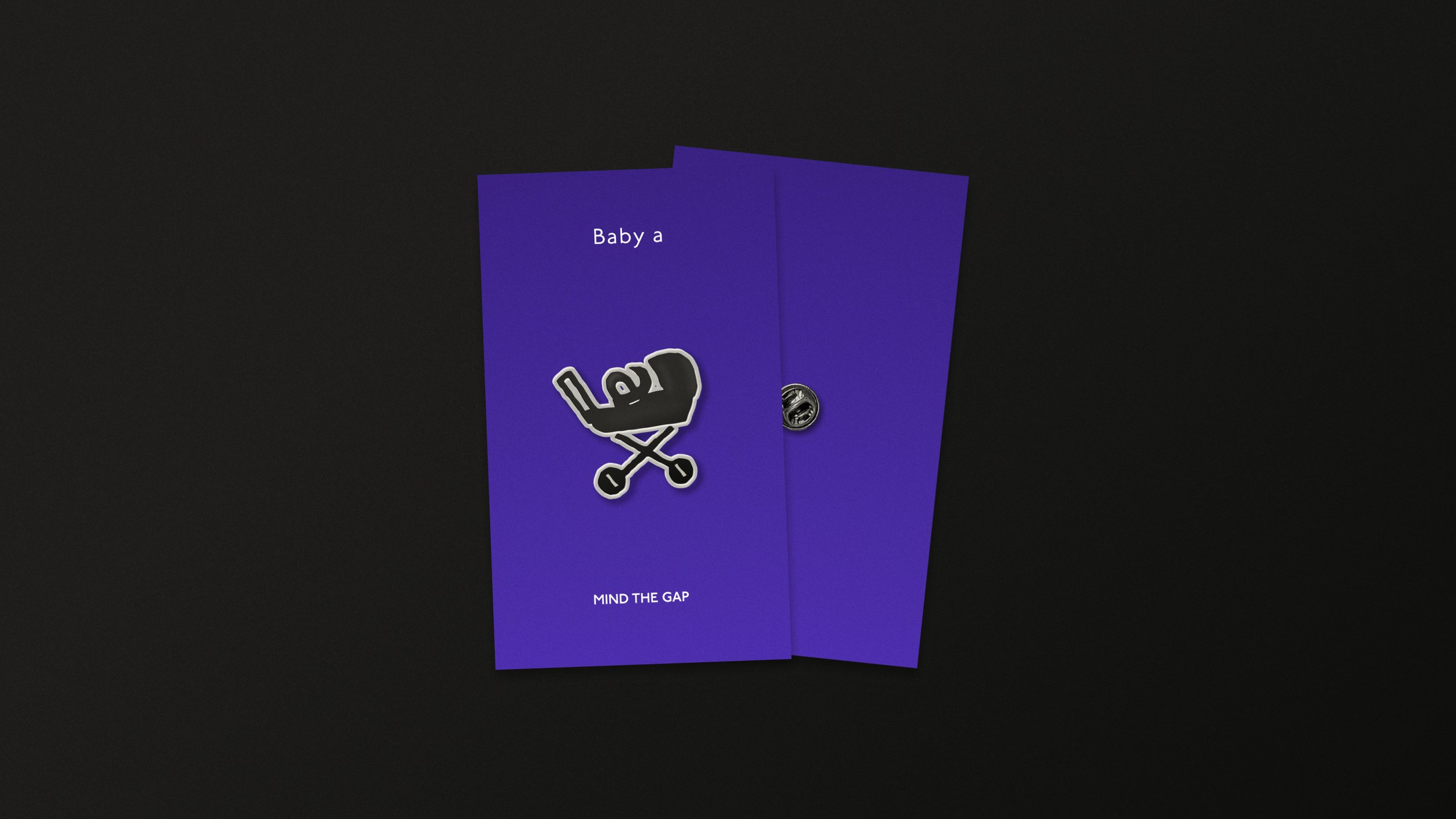
All versions of the letter A character with items you frequently see with people on the Tube.
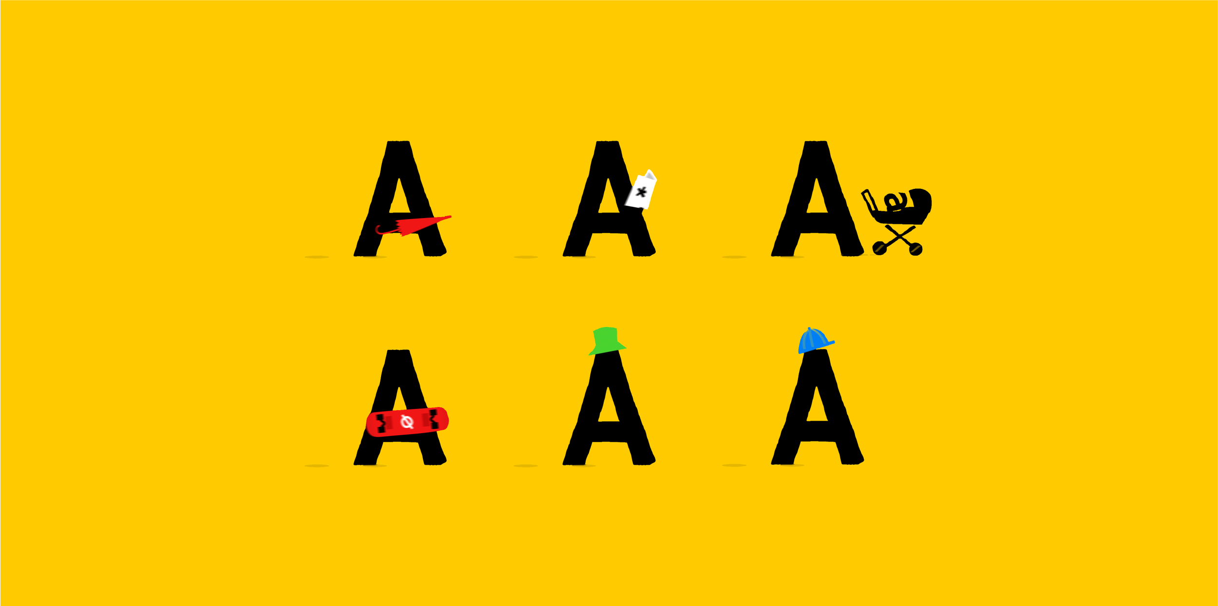
Walking letter A
Showcasing the main idea, which is self-explanatory. It highlights the play with typography, with a gap separating the three "artboards."
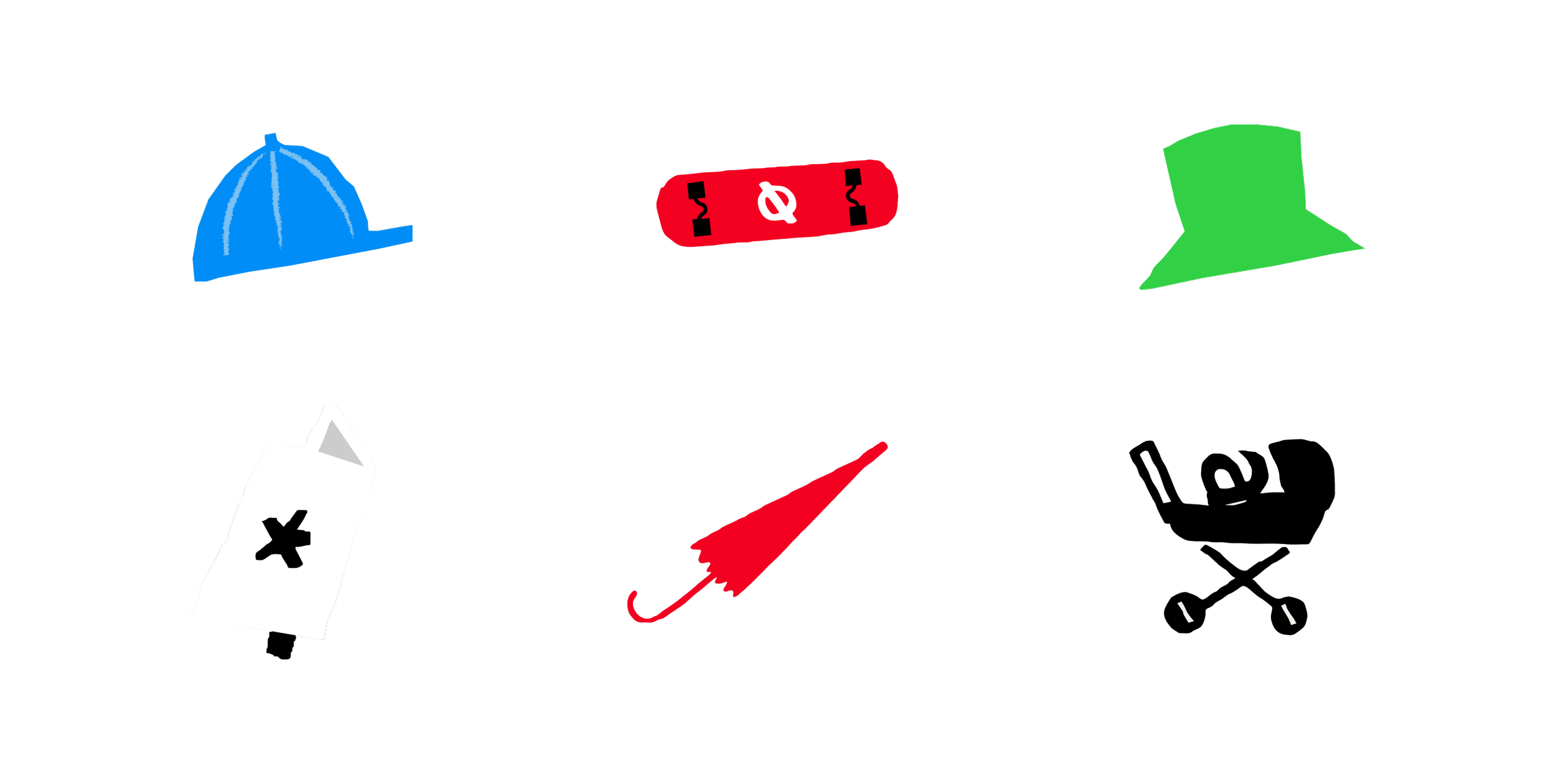
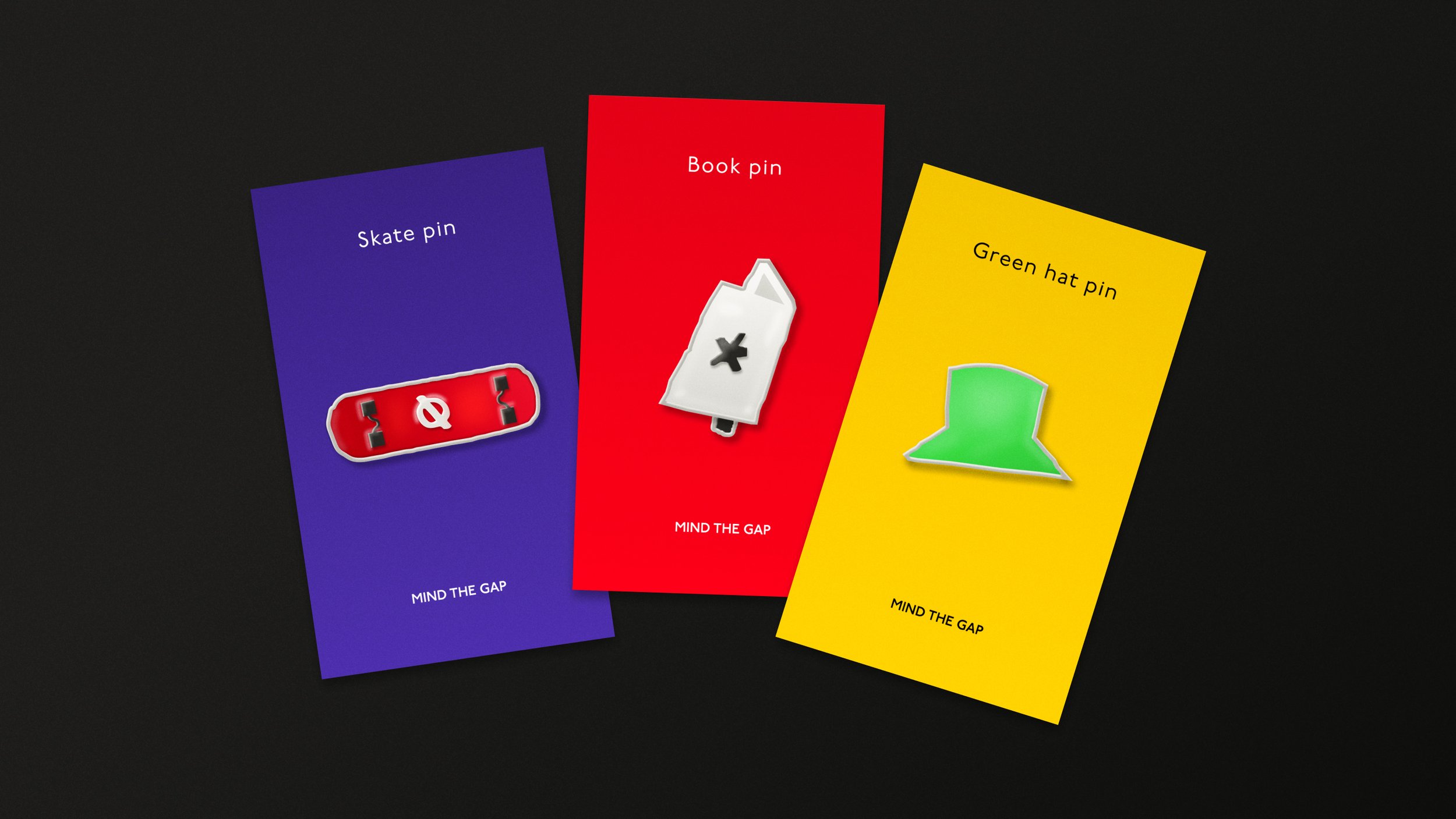
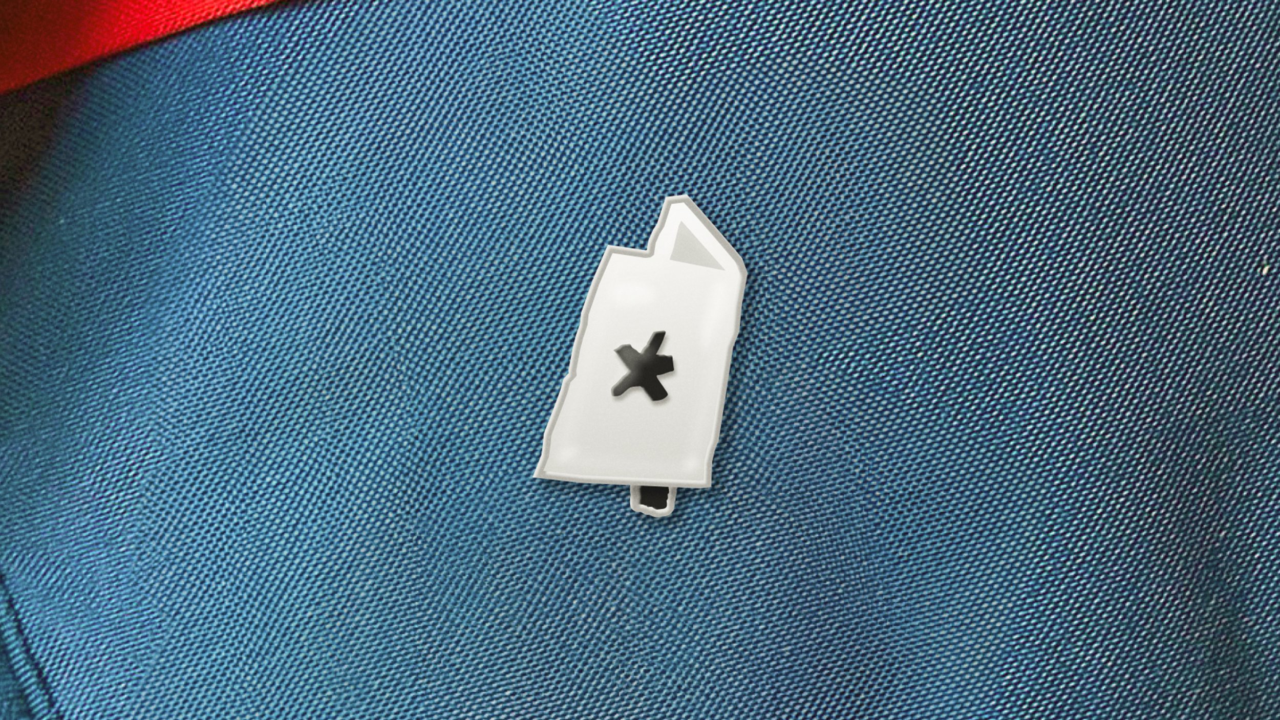
Illustrations
A close look at the stylized illustrations of all the items.
Bringing life to the “Keep left” sign.
Animated interpretation of the “Keep left” sign from the London Underground, paired with an original background photograph. Commonly found at exits, entrances, and stairways throughout the Underground, the sign is reimagined through motion to highlight the expressive potential and strength of animated typography.
“A”
A closer look at the central art-board highlights the walking letter "A" and its playful typography.
The rough-edged style choices for the letters and illustrations reflect the imperfect shapes and coloured lines painted on the floors of London Underground platforms, echoing its heritage.


One art-board layout
Another version showcasing the walking "A" concept and the gap between letters when all the content is laid out on a single art-board, with a background picture taken by me.
Collectibles


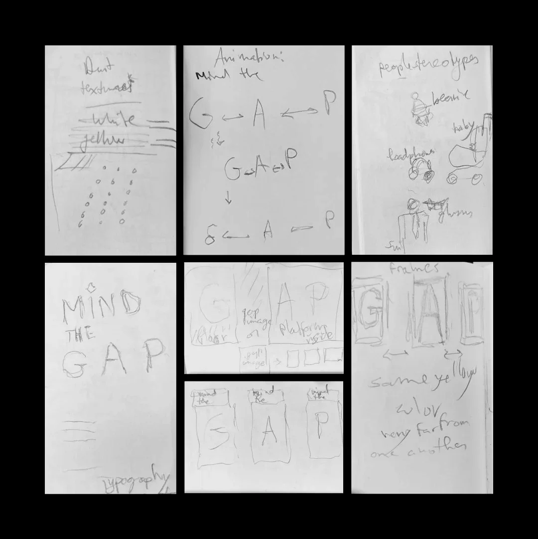
Sketchbook
A small pocket sketchbook, always close at hand. These pages capture early ideas sparked while waiting for a train at Gunnersbury Station in London.